

Why Does My Area Feel Flat If Atlanta Is "Still Expensive"? What's Really Happening in Metro Atlanta 2026
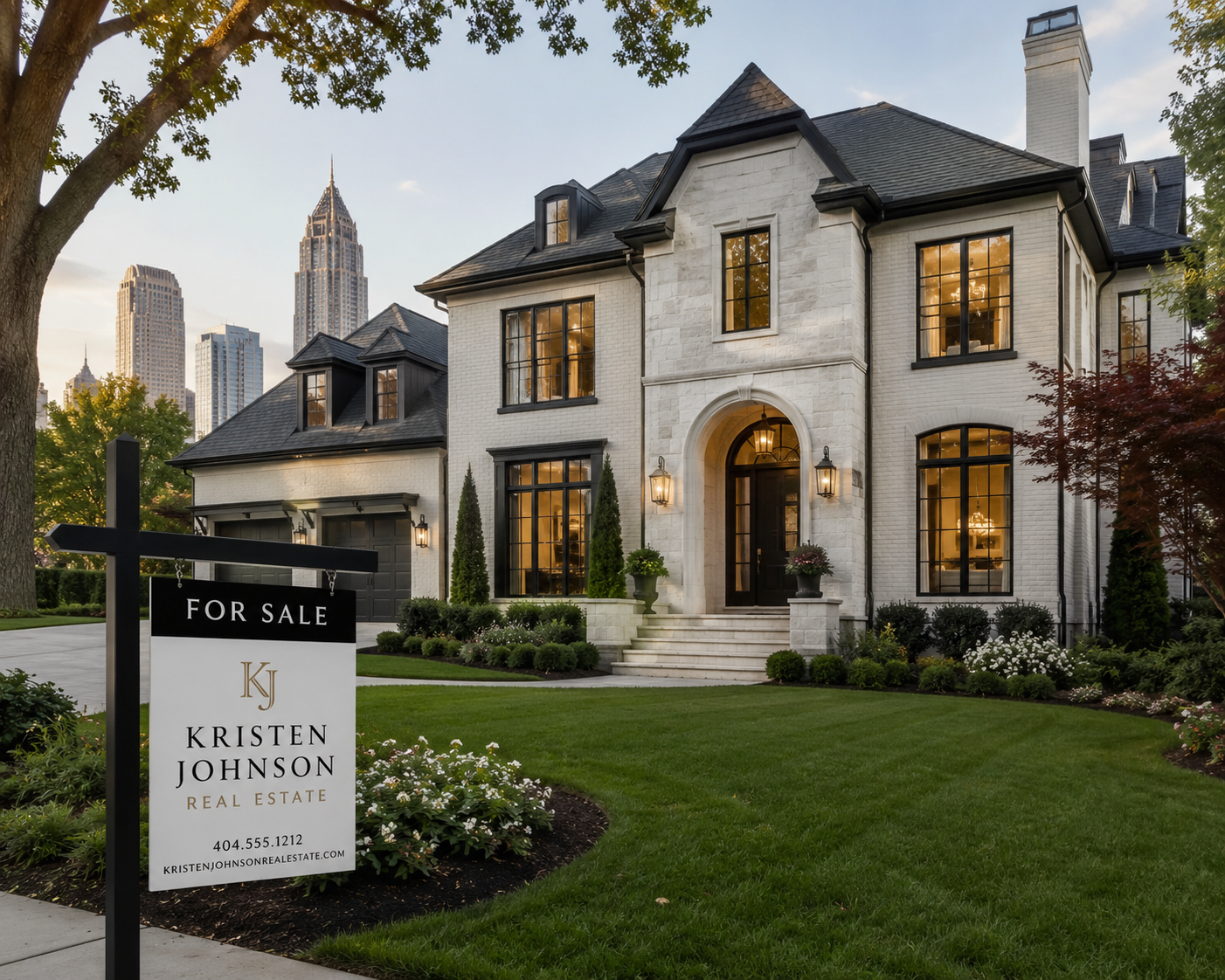
If your part of Metro Atlanta feels flat while every headline says Atlanta is still expensive, both things are true at once. Atlanta is one market in name only. Underneath the metro-wide median price, there are hundreds of separate submarkets moving in different directions at the same time, and the gap between the strongest and the weakest has been widening for three years straight.
I work with buyers and sellers across Metro Atlanta, from intown neighborhoods to the North Fulton suburbs to the south metro counties. The single most common point of confusion I hear right now sounds like this: "I keep reading that Atlanta home prices are high and rising, but my house hasn't moved in two years. Why?" Or the buyer version: "If the market is so hot, why has this listing been sitting for 80 days?"
Nearly a decade of helping people buy and sell here has taught me that the metro-wide number is almost useless for answering a question about one specific house on one specific street.
Here's what you need to know.
The Short Answer: "Atlanta" Is Not One Housing Market
When a national outlet or a Zillow page reports that "Atlanta home prices" did something, they are averaging across an enormous and wildly uneven area. The Atlanta REALTORS Association and First Multiple Listing Service track an 11-county region: Cherokee, Clayton, Cobb, DeKalb, Douglas, Fayette, Forsyth, Fulton, Gwinnett, Paulding, and Rockdale. That is roughly 8,300 square miles and well over six million people.
A median price for that entire footprint blends a $2 million estate in Milton with a $230,000 starter home in Clayton County. It blends a renovated BeltLine-adjacent bungalow that drew six offers with a dated split-level two counties away that has sat unsold since winter. The median is mathematically real. It just does not describe any actual neighborhood, and it definitely does not describe your house.
So when the metro median holds steady or ticks up while your area feels frozen, there is no contradiction. The metro number can rise because the expensive, high-demand pockets are still climbing, even as a large share of more affordable and middle-market areas go flat or slip. The average hides the split. Your block lives on one side of that split or the other.
What "Flat" Actually Means Right Now
Before going further, it helps to separate the metro picture from the local one with current numbers.
As of spring 2026, the Metro Atlanta market overall looks like a market that has normalized rather than crashed. The FMLS March 2026 Market Brief put the metro median sales price at $418,000, down about 1.6 percent year over year, with the average sales price at $525,500. Active listings reached 17,723, up roughly 5 percent from a year earlier, and supply sat at four months. Different data providers report different medians depending on which counties and property types they include, which is itself part of the confusion: Redfin reported a March 2026 metro median around $434,000, Zillow's typical-value figure for the City of Atlanta sat near $380,000, and the Georgia MLS region tracked closer to $389,000 in early 2026. All of these are "Atlanta." None of them agree, because they are measuring different geographies.
What they do agree on is direction. Prices are not surging. They are flat to slightly soft, inventory is up, and homes take longer to sell. The FMLS data showed metro homes broadly taking longer to move than they did a year earlier, and Redfin reported Atlanta homes selling after about 70 days in March 2026 compared to 57 days the prior year.
That is the metro. Now the local part. "Flat," in your specific area, usually means one or more of these things:
Your home's estimated value is roughly the same as it was 18 to 24 months ago, with no meaningful gain.
Homes near you are taking 60, 80, even 100-plus days to sell, often with one or more price reductions along the way.
Buyers are touring but not offering, or offering well under list.
The price you could realistically sell for today is close to, or below, what comparable homes fetched in 2022.
If that describes your area, you are not imagining it, and you are not doing anything wrong. You are in one of the parts of Metro Atlanta that the headline number is quietly averaging over.
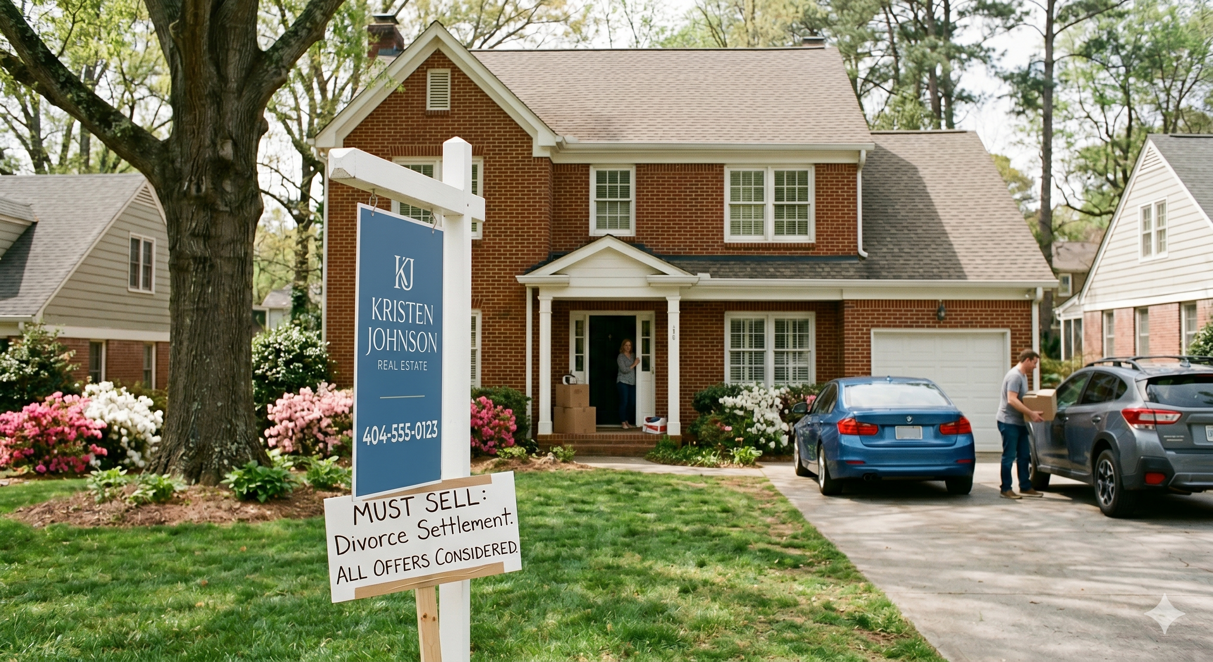
The K-Shaped Market: The Single Most Important Thing to Understand
The clearest way to describe what is happening across Metro Atlanta in 2026 is what analysts call a K-shaped market. The two arms of the letter K go in opposite directions, and that is exactly what neighborhood-level data shows.
In April 2026, a Realtor and investment specialist named David Holcombe published an interactive Atlanta Neighborhood Appreciation Map covering 207 City of Atlanta neighborhoods. The map tracks single-family home appreciation over three and five-year windows. The finding, as reported by Urbanize Atlanta and Hoodline, was stark: the city's trajectory is distinctly K-shaped, with higher-priced neighborhoods continuing to post gains while more affordable neighborhoods stall or decline.
The numbers behind it are worth sitting with. According to that analysis, top-performing neighborhoods averaged roughly 5 to 6 percent annual appreciation over the past three years, while some of the least expensive areas lost as much as 7 percent over the same window. Neighborhoods like Collier Hills, Virginia-Highland, and Chastain Park kept climbing. Wide stretches of southwest Atlanta and several intown pockets registered some of the steepest declines. Even Midtown, long associated with growth, looked nearly flat on the three-year view, and Old Fourth Ward, a neighborhood people associate with BeltLine-fueled appreciation, was down more than 2 percent.
That is the whole story in one data set. Two neighborhoods, both inside the City of Atlanta, both technically part of the same "expensive Atlanta market," moved in completely opposite directions over the same three years. The metro median averaged them together and reported something in the middle that neither neighborhood actually experienced.
This is not unique to the city limits. The same divergence runs through the suburbs. North Fulton job-corridor markets and established Buckhead pockets behave differently from outer Paulding County or parts of the south metro. The pattern holds: the strong arm of the K and the weak arm of the K are often a 20-minute drive apart.
Why the Split Is Happening: Six Real Reasons
A K-shaped market is not random. Specific, identifiable forces are pushing some areas up and holding others down. Here are the six that matter most.
1. Interest rates changed who can buy where
Mortgage rates have hovered in the low-to-mid 6 percent range, a different world from the sub-3 percent rates of 2021. That change did not hit every price point equally.
In lower and middle price tiers, buyers are extremely payment-sensitive. When the monthly cost of the same house jumps by hundreds of dollars because of rate movement, a meaningful share of buyers in that tier simply drop out or drop down. That thins demand in affordable areas and softens prices.
In the upper tiers, a larger share of buyers pay cash or are less affected by financing costs, so demand holds up better. Even within luxury, though, there is a split: the Luxury Realtor Group's spring 2026 analysis found the $1M to $2M range appreciating around 4.2 percent annually, the $2M to $3M segment slowing to about 2.8 percent, and properties above $3M essentially flat year over year. The rate effect ripples all the way up. It just hits hardest at the bottom. If you're a buyer trying to decide whether the rate environment means you should move now or wait, I've written a separate guide on buying at 6 percent versus waiting for rates to drop.
2. Inventory came back, but not evenly
Metro inventory is up across the board, but the increase lands differently depending on where you are. In a high-demand neighborhood with limited land and strong buyer interest, more listings just mean buyers finally have a choice or two. Prices hold. In an area where demand was already thin, the same percentage increase in listings can tip the local balance firmly toward buyers, and prices give.
Months of supply is the metric that captures this. The metro sits around four months, which is roughly balanced. But that is an average. Some intown and North Fulton pockets are still running tight, closer to a seller's market. Other areas are sitting at six-plus months of supply, which is a buyer's market by any standard. Same metro, opposite conditions.
3. The "drivable to amenities" premium got sharper
Buyers in 2026 are deliberate. They tour multiple homes, they compare, and they are paying real premiums for specific, walkable, amenity-rich locations: BeltLine access, a walkable commercial corridor, established town centers. Areas with those features held demand. Areas without them, especially those that depended on cheap money and pandemic-era urgency to pull buyers out, lost the buyers who were only there because rates were low and competition forced their hand.
This is verifiable on the ground. A neighborhood with a finished BeltLine segment, a grocery store, and restaurants within walking distance is a different product than a subdivision 40 minutes from anything, and in a selective market buyers price that difference more aggressively than they did in 2021.
4. Condition and updates matter again
During the frenzy, buyers overlooked dated kitchens and deferred maintenance because they had no choice. That is over. Today's buyers gravitate toward homes that feel move-in ready and negotiate hard, or walk, on homes that need work.
This shows up as a within-neighborhood split, not just a between-neighborhood one. On the same street, a renovated home can still sell quickly and near asking while the dated house three doors down sits for 90 days and takes two price cuts. If your area is full of original-condition homes and you are watching the renovated outliers as your comparison point, your area will feel flatter than it is, because you are comparing your home to a different product.
5. New construction is competing for the same buyer
In fast-growing counties, builders are still delivering new homes, and a new build with a builder rate buydown and a warranty is a serious competitor to an existing resale home nearby. In areas with heavy new construction, that competition caps how much existing homes can appreciate. In built-out areas with little or no new supply, existing homes do not face that pressure. Two more reasons for the same metro to split.
6. Each area started this cycle at a different point
Some neighborhoods appreciated so fast in 2020 through 2022 that they overshot. Decatur is a clear example: it saw outsized appreciation, then a sharper correction in late 2025, with prices and price per square foot pulling back and homes taking around 50 days to sell. That is not collapsing demand. It is a correction from extraordinary conditions back toward sustainable ones. An area that ran up 40 percent in two years and then gave back 5 percent feels flat to the owner, even though it is still far above where it started. Meanwhile, an area that never spiked has less to give back and can look more stable. Where your area sits today depends heavily on where it was in 2019.
Why Zillow and National Headlines Make This Worse
Part of why your area can feel flat while the story says "expensive" is that the most visible data sources are structurally bad at the local level.
Automated valuation models like the Zillow Zestimate rely on broad data and past sales. They are reasonable at the metro scale and unreliable at the block scale. Two homes with similar square footage can sell for very different prices depending on exact location, renovation quality, layout, and lot, and an algorithm cannot see most of that. It cannot see that one home backs to the BeltLine and the other backs to a busy road. It cannot see that one kitchen is a real $75,000 remodel and the other is painted cabinets with new hardware. It does not know what is actively listed and competing right now, because it looks backward at closed sales.
National headlines have the opposite problem. They are accurate but too zoomed out. "Atlanta home prices rise" can be a true statement about the metro median and a useless statement about your zip code at the same time. The headline is not lying. It is just answering a different question than the one you are asking.
The result is a buyer or seller reading an optimistic national story, checking an algorithm that is confidently wrong about their specific street, and ending up with a picture of their market that does not match what is actually happening outside their front door.
What This Means If You're Selling
If your area feels flat and you are thinking about selling, the K-shaped market changes your strategy, but it does not mean you cannot sell well.
Price to today, not to 2022 and not to your neighbor's Zillow estimate. The most expensive mistake I see sellers make is anchoring to a peak number, listing high to "leave room to negotiate," and then watching the home sit. In a selective market, an overpriced home does not draw low offers. It draws no offers, because buyers simply tour the better-priced option instead. Then it goes stale, and stale homes sell for less than correctly priced ones would have. Pricing accurately from day one is not giving up leverage. It is the strategy.
Compete on condition and presentation. In a market where buyers reward move-in-ready, the controllable factors matter more than ever: paint, clean and functional kitchens and baths, flooring, decluttering, and staging, physical or virtual. You may not control your area's appreciation arm of the K, but you control whether your specific home is the one buyers choose within it.
Get a real comparative market analysis, not an algorithm. You need someone to pull genuine comparable sales for your specific street and segment, look at what is actively listed against you right now, and tell you honestly which arm of the K your area is on. That number may be lower than the headline implied. It is still the number that gets you sold instead of sitting.
Understand that flat is not frozen. Homes in slower areas are still selling. They sell when they are priced right, prepared well, and marketed properly. "My area is flat" is a reason to be strategic, not a reason to wait indefinitely while carrying costs pile up.
What This Means If You're Buying
For buyers, a K-shaped market is genuinely good news, as long as you read it correctly.
You have negotiating room in the softer areas. In parts of the metro running six-plus months of supply, with homes sitting and price reductions common, you have leverage that did not exist three years ago: room to negotiate price, ask for repairs, request closing-cost help, and take the time to inspect properly without losing the house to a competing offer in 24 hours. I've written separately about what actually works when negotiating in the 2026 Atlanta market.
The strong-arm areas still require speed. If you are shopping a high-demand intown pocket or a sought-after North Fulton corridor, you are in a different market within the same metro. Well-priced homes there still move fast and can still see competition. You need to be pre-approved, decisive, and ready.
Know which arm of the K you are shopping before you write an offer. This is the single most useful thing you can do. The right offer strategy in a slow area, lower, with contingencies, patient, will lose you the house in a hot one. The aggressive strategy that wins in a hot area will cause you to overpay in a slow one. Buyers who do not understand this divergence routinely overpay by tens of thousands of dollars, or lose homes they could have had, simply because they applied the wrong playbook.
Do not let a flat area scare you off a good house. An area appreciating slowly is not automatically a bad buy. If the home fits your life, the price reflects current conditions, and you plan to stay several years, slower near-term appreciation is a normal feature of a normal market. The buyers who get hurt are the ones who bought purely for fast appreciation and need it to continue. Most buyers are not in that position.
How to Actually Find Out What Your Area Is Doing
Here is the practical part. To replace "Atlanta is still expensive" with a real answer about your area, you want neighborhood-level data, not metro-level data.
Look at sold prices on your specific street and in your specific segment over the last three to six months, not the metro median and not active list prices, which only tell you what sellers hope to get.
Look at days on market for your segment. Rising days on market is the clearest early signal that an area is softening, often before median price moves at all.
Look at the price-cut rate near you. A high share of nearby listings with reductions tells you the local balance has shifted toward buyers.
Compare like to like. A renovated home and an original-condition home in the same neighborhood are different products. Make sure your comparison set actually matches your home's condition and features. For a real example of how this looks at the neighborhood level, my breakdown of how much homes actually cost in East Atlanta walks through price tiers and what buyers get in each one.
Check months of supply for your area specifically, not the metro figure. That single number tells you which arm of the K you are on faster than almost anything else.
This is exactly the kind of analysis I do for clients, and it is the difference between a decision based on a headline and a decision based on your actual situation. A metro median cannot tell you whether to list now or wait, or whether a specific listing is a deal or a trap. Neighborhood-level data can.

Frequently Asked Questions
Why does my Atlanta home's value feel flat when the news says prices are rising?
Because "Atlanta" in those headlines means an 11-county metro median that averages hundreds of separate submarkets together. Some Metro Atlanta areas are still appreciating while others are flat or declining. The metro number can rise because of strength in expensive, high-demand pockets even while a large share of more affordable and middle-market areas go flat. The headline is describing the average. Your home lives in one specific neighborhood, not the average.
Is the Atlanta housing market going up or down in 2026?
Both, depending on where you look. At the metro level, spring 2026 data shows prices roughly flat to slightly soft year over year, inventory up, and homes taking longer to sell, a normalized market rather than a crashing or surging one. At the neighborhood level, it is K-shaped: higher-priced, amenity-rich areas have generally kept appreciating while many more affordable areas have stalled or declined. There is no single answer because there is no single Atlanta market.
What is a K-shaped housing market?
It describes a market splitting in two directions at once, like the two arms of the letter K. In Metro Atlanta, an April 2026 analysis of 207 City of Atlanta neighborhoods found top-performing neighborhoods averaging roughly 5 to 6 percent annual appreciation over three years while some of the least expensive areas lost as much as 7 percent over the same period. Strong areas got stronger, weaker areas got weaker, and the gap between them widened.
Why is my house not selling if Atlanta is a hot market?
Usually because your specific area is on the softer side of the K, your home is priced to a past peak rather than today's conditions, or your home is competing on condition against more updated listings nearby, or some combination. In a selective 2026 market, buyers tour multiple homes and choose the best-priced, best-presented option. An overpriced home does not draw low offers. It draws none. The fix is accurate pricing and strong presentation, not waiting for the market to rescue the listing.
Can I trust my Zillow estimate to tell me what my home is worth?
Use it as a rough starting point, not a final answer. Automated valuation models rely on broad past-sales data and cannot see the things that move price most at the local level: exact location within a neighborhood, renovation quality versus surface updates, layout and lot usability, and what is actively listed against you right now. Two similar-square-footage homes can sell for very different prices for reasons an algorithm cannot detect. For a real number, you need a comparative market analysis built on your specific street and home.
How can I find out what my specific Atlanta neighborhood is doing?
Look at neighborhood-level data, not metro data: recent sold prices on your street and in your home's segment, days on market for that segment, the share of nearby listings with price cuts, months of supply for your area specifically, and a comparison set that matches your home's actual condition. Rising days on market and a high price-cut rate are early signals of softening. A real estate agent can pull all of this for your exact address.
Is it a good time to buy in Atlanta if my target area feels flat?
It can be a good time, and a flat area is often where buyers have the most leverage: room to negotiate price, ask for repairs and closing-cost help, and take time to inspect properly. A slowly appreciating area is not automatically a bad buy if the home fits your life, the price reflects current conditions, and you plan to stay several years. The buyers who get hurt are the ones counting on fast appreciation to continue. Most buyers are not in that position.
Are Atlanta suburbs or intown neighborhoods holding value better in 2026?
It is not a clean suburb-versus-intown split. The divergence runs through both. Some intown neighborhoods kept climbing while other intown pockets, including parts of southwest Atlanta and even areas associated with the BeltLine, declined. In the suburbs, North Fulton job-corridor markets behave differently from outer-county areas with heavy new construction. The reliable predictor is not suburb versus intown. It is demand fundamentals, amenities, inventory, and where the area started this cycle.
Why do different websites show different median prices for Atlanta?
Because they measure different geographies and property types. The Atlanta REALTORS Association and FMLS track an 11-county region. Other sources use the City of Atlanta only, or different county sets, or include or exclude condos and townhomes. In early 2026, you could find credible Atlanta medians ranging from the high $370,000s to the mid $430,000s depending on the source. They are not contradicting each other so much as answering different questions.
Should I wait to sell until my area "recovers"?
Be careful with that plan. "Flat" is not "frozen," and homes in slower areas are still selling when priced and presented well. Waiting has real costs: ongoing mortgage payments, taxes, insurance, and maintenance, plus the risk that conditions soften further or that your home becomes stale inventory if you list too high first. A correct-from-day-one pricing strategy in today's market usually beats waiting for a recovery that may be slow and uneven. The right move depends on your specific area and timeline, which is worth analyzing directly rather than guessing.
The Bottom Line
If your area feels flat while Atlanta is "still expensive," you are not confused and you are not wrong. You are noticing something real that the headline number is built to hide. Metro Atlanta is not one housing market. It is hundreds of them, and in 2026 they are splitting into a clear K shape, with strong, amenity-rich areas still climbing and many more affordable and middle-market areas flat or sliding.
The metro median is a fine number for a national news story. It is the wrong tool for deciding whether to list your house, what to offer on a home, or whether to buy now or wait. Those decisions require neighborhood-level data about your specific street and your specific segment.
I work with buyers and sellers across Metro Atlanta and spend my time in exactly this kind of block-by-block detail, because it is the only level at which the real answer lives. If you want to know what your area is actually doing, not the metro, not a Zillow estimate, but your area, let's talk.
Visit kristenjohnsonrealestate.com or reach out directly. Come as you are, come on home.
Looking for more straight talk on the Metro Atlanta market? I've also written about what's really behind Atlanta's prices, investors or supply, whether to buy now at 6 percent or wait for rates to drop, how to negotiate in the 2026 Atlanta market, and how much homes actually cost in East Atlanta, a real example of neighborhood-level pricing detail. Browse the full series at kristenjohnsonrealestate.com.